Arts Digital Art
Intermediate
40 mins
Teacher/Student led
80 points
What you need:
Chromebook/Laptop/PC or iPad/Tablet

Introduction to Color Theory

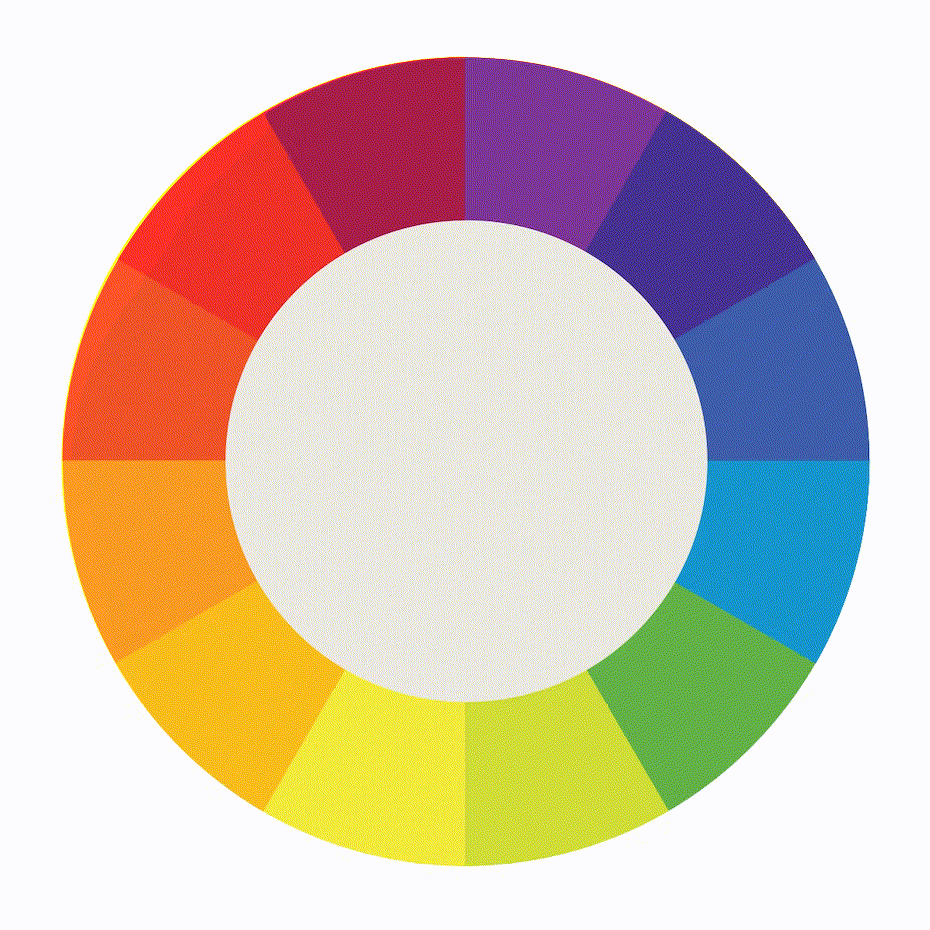
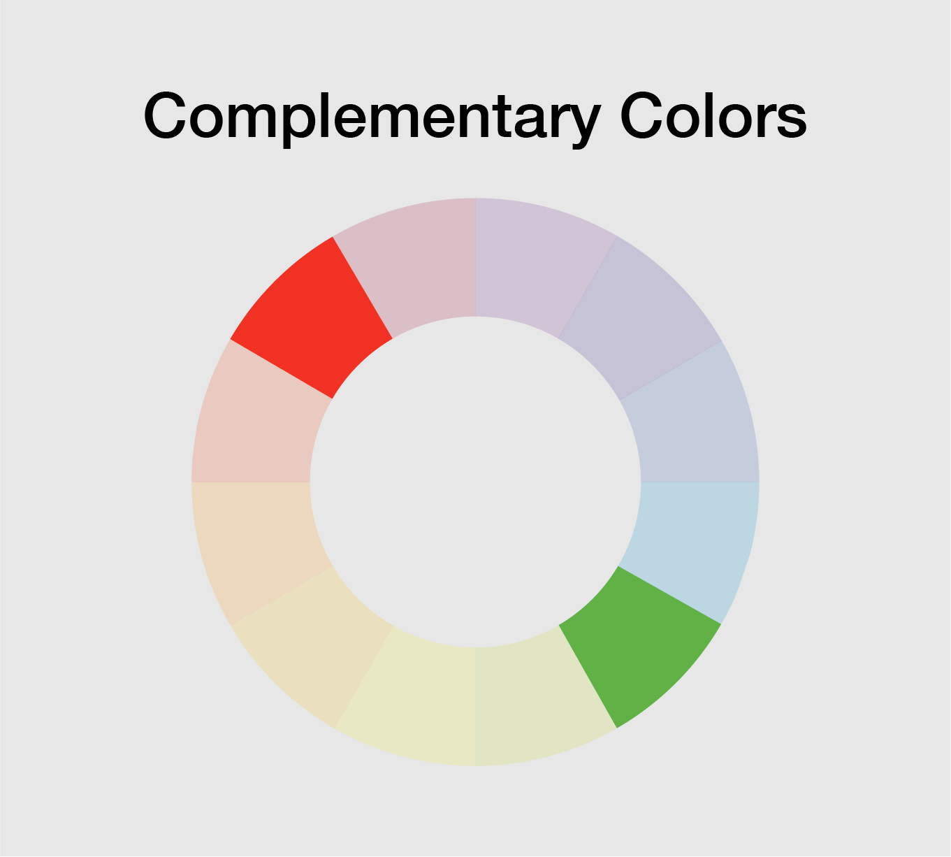
Embark on a journey through colour theory, starting with the basics of the colour wheel. Learn about primary, secondary, and tertiary colours, and explore complementary and analogous colour schemes. Understand and manipulate hue, saturation, and brightness, and apply these concepts to create high and low contrast in your digital art. Finally, apply all these principles to create visually appealing digital artwork.
Learning Goals Learning Outcomes Teacher Notes

Live Class Feed

This is a live feed of the latest activity by your students on this lesson. It will update in real-time as they work on the lesson.
Load previous activity

    1 - Introduction to the Color Wheel

    Color is a fundamental element in the world of art and design. Understanding color theory is essential for creating visually appealing artwork. In this lesson, we will introduce you to the basics of color theory and how to apply it to your digital art.

    The color wheel is a visual representation of the relationships between colors. It is a tool that artists and designers use to create harmonious color schemes.

    • The primary colors are red, blue, and yellow, and these colors cannot be created by mixing other colors.
    • Secondary colors are created by mixing two primary colors, and these colors are green, purple, and orange.
    • Tertiary colors are created by mixing a primary color with a secondary color.

    2 - Complementary and Analogous Color Schemes

    Complementary colors are located opposite each other on the color wheel. When used together, they create high contrast and vibrant visual impact. Analogous colors are located next to each other on the color wheel. These color schemes create a sense of harmony and are pleasing to the eye.


    3 - Hue, Saturation, and Brightness

    • Hue refers to the color itself, such as red, blue, or green.
    • Saturation refers to the intensity of the color, from pure color to a shade of gray.
    • Brightness refers to the lightness or darkness of the color. 

    These properties are used in digital art to adjust the color and create various effects.


    4 - Adjusting Hue, Saturation, and Brightness

    In Photopea, you can adjust the hue, saturation, and brightness of an image by selecting the "Hue/Saturation" adjustment layer.

    • To adjust the hue, move the slider left or right to change the color. To adjust the saturation, move the slider up or down to make the color more or less intense.
    • To adjust the brightness, move the slider up or down to make the color lighter or darker.

    5 - Contrast in Digital Art

    Contrast refers to the difference in color and brightness between two elements. In digital art, contrast is used to create visual interest and to draw the viewer's eye to a specific area. High contrast creates bold and dramatic effects, while low contrast creates a subtle and subdued effect.


    Unlock the Full Learning Experience

    Get ready to embark on an incredible learning journey! Get access to this lesson and hundreds more in our Digital Skills Curriculum.

    Copyright Notice
    This lesson is copyright of Coding Ireland. Unauthorised use, copying or distribution is not allowed.
    🍪 Our website uses cookies to make your browsing experience better. By using our website you agree to our use of cookies. Learn more