HTML
CSS
Advanced
30 mins
Teacher/Student led
+85 XP
 Chromebooks, laptops, and PCs are crucial tools for coding and digital skills education. Chromebooks are ideal for web-based applications and collaborative projects, while laptops and PCs support a wider range of programming environments and software for more intensive tasks like software development and data analysis.
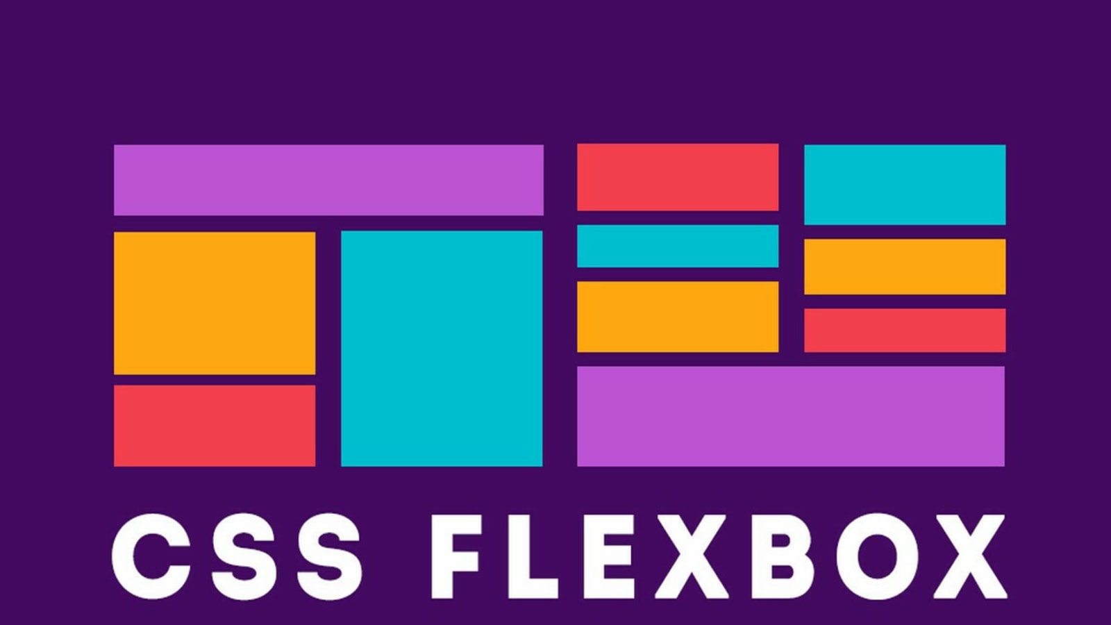
Introduction to Flexbox
Learn the basics of the Flexbox layout model and create a navigation bar using Flexbox properties.