 Chromebooks, laptops, and PCs are crucial tools for coding and digital skills education. Chromebooks are ideal for web-based applications and collaborative projects, while laptops and PCs support a wider range of programming environments and software for more intensive tasks like software development and data analysis.
What is a Chart?
Discover the world of charts and create your very own chart to visualize data!
Welcome to the world of charts! In this lesson, you will learn about different types of charts and how they help us understand data. You will also create your very own chart using paper, pencils, and crayons or colored pencils. Let's get started!
First, let's talk about what a chart is. A chart is a visual representation of data that makes it easier to understand and analyze. There are many types of charts, such as pie charts, bar charts, and line charts. Each type of chart is used to display different kinds of data.
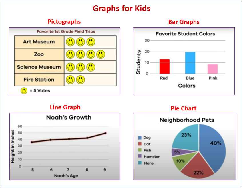
Now, let's explore some examples of charts. Look at the following images:
Pie Chart: A pie chart is a circular chart divided into slices, where each slice represents a part of the whole. The size of each slice is proportional to the percentage it represents.
Bar Chart: A bar chart is a chart that uses rectangular bars to represent data. The length of each bar is proportional to the value it represents.
Line Chart: A line chart is a chart that uses lines to connect data points and show trends over time.
Now that you have seen some examples of charts, let's move on to the next step where you will choose the data you want to represent in your chart.
Think of a topic you like, such as your favorite animals, fruits, or even ice cream flavors. Follow these steps to create the data for your chart:
Now you have the data for your chart!
Now, it's time to draw a chart! Follow these steps to create your chart:
At the top of your chart, write a title that describes your data. For example, if you chose your favorite animals, you could write 'My Favorite Animals' as the title. Then, label the two sides of your chart. The left side should be labeled 'Number of Times' and the bottom side should be labeled with the names of your 5 items.
Now, let's draw bars for each of your 5 items to show how many times you have seen or eaten them. Follow these steps:

Get ready to embark on an incredible learning journey! Get access to this lesson and hundreds more in our Digital Skills Curriculum.

.png)