Here is the tally we collected for how the class gets to school: Walk has 12, Cycle has 5, Bus has 8, Car has 3. A tally is great for counting, but it is hard to tell at a glance which way is the most popular. What is the same and what is different about these four counts? Which one would be the tallest if we drew it as a picture?
Three bar charts on screen: how we get to school, favourite fruit, and car colours. Watch how each bar's height matches its count, and how you read a bar by tracing its top across to the side scale. Be ready to name the shortest bar and the second-place fruit.
Today we build the bar chart for our travel-to-school tally together. The counts are Walk 12, Cycle 5, Bus 8, Car 3. We will drag each bar up until its height matches the count, then read it back to check it lines up with the right number on the side scale.
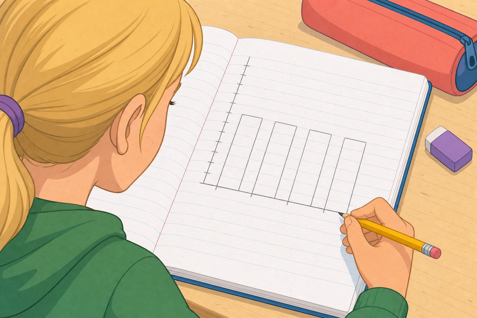
In your maths copy, sketch the bar chart frame: a side scale going up in twos (0, 2, 4, 6, 8, 10, 12) and the four labels along the bottom — Walk, Cycle, Bus, Car. Now draw each bar to match the tally we collected: Walk 12, Cycle 5, Bus 8, Car 3. Label both axes.
We have a few bar-chart jobs to work through at the board, each one a little trickier. First, match a chart to its tally. Next, read the Pear bar off a fruit chart that already has three bars filled. Last, build a chart where two bars come out the same height. We will check each answer together before moving on.
Why does the height of each bar tell the story so quickly? What would change if we made the bars wider instead of taller — would the chart still tell us who was most popular?
Next we look at choosing a scale: what to do when one bar is huge and the others are tiny, so we can step the side scale in twos, fives or tens to make the chart easy to read.
You're previewing this lesson. Get full access to this lesson and hundreds more — each one ready to teach, with interactive activities, printable resources and pupil progress tracking built in.