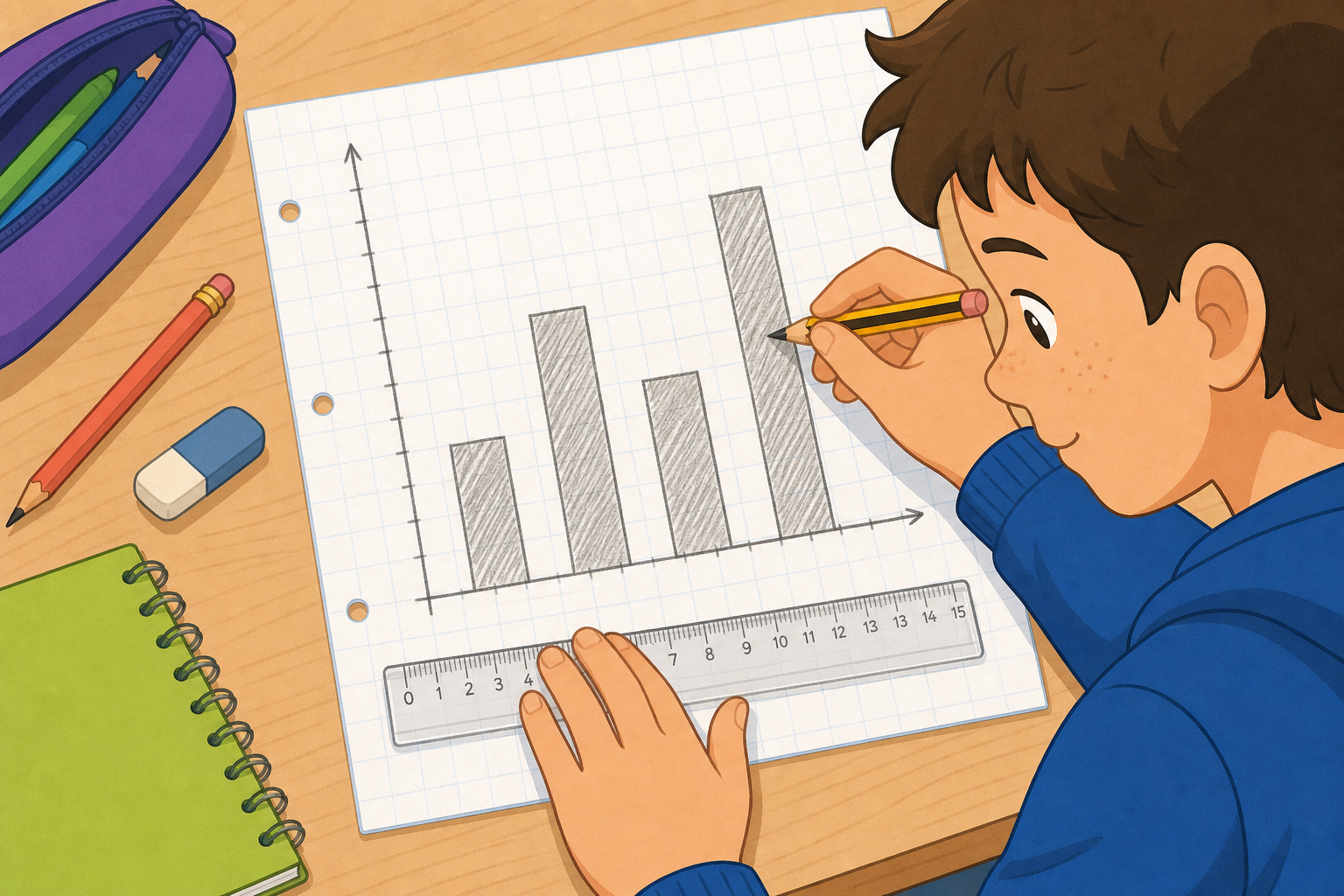
Here is a bar chart showing the favourite sports of one class. It does its job for one group. But what if we wanted to show our class and the class next door on the very same chart, so we could compare them at a glance?
How could we fit two groups onto one set of axes without it turning into a mess?
Display a simple single-group bar chart as pupils settle. Take two or three hands-up ideas only, not open call-outs. Don't reveal the multiple-bar answer yet — that lands in the next step. Listen for the idea of "two bars beside each other" and revoice it warmly.
Four bar charts appear one at a time. Watch how each one reads its side scale, and how some charts show two bars for every category so we can compare two classes. On the last chart, look for where the two classes differ most.
Favourite sports (one group): one bar per category, scale in 2s. Read GAA off the scale as 9; others 7, 4, 3.
Lunch choices (two classes): two bars per choice, coloured by the key. Ask which colour is which class, and revoice that the key is the only way to tell. 6th Class 6, 11, 8; 5th Class 9, 7, 5.
Scale in 5s: point to the yard bar, ask is that exactly 18 or near it. Counting in 1s would be slow; steps of 5 stay readable. Values 12, 18, 9, 14.
Biggest difference: trace the gap for each club. Art 10 and 9, gap 1; drama 6 and 8, gap 2; coding 13 and 4, gap 9. Ask which gap is biggest. Biggest difference is coding, and note this names a category, not a group.
New vocabulary: key, two bars per category, biggest difference as the largest gap between a category's two bars.
Today we build a multiple bar chart together, starting from an empty grid. Our data compares two classes on how they travel to school: walk, cycle, car. The chart begins blank, and as the class reads out each number we set that bar's height, colour the two groups differently, and add a key so anyone could read it.
In 6th Class, ten pupils walk, six cycle and eight come by car. In 5th Class, seven walk, four cycle and twelve come by car.
This round is for talking it through together — the chart starts empty and pupils take turns at the board to set each bar while the class agrees or corrects out loud.
Build the 6th Class bars first, then the 5th Class series, so the side-by-side pairing builds up visibly. Each time a bar goes up, ask the class to read its height off the scale before confirming. Watch for the slip of reading the wrong colour — point back to the key. Keep it brisk; rotate three or four pupils to the board.
In your maths copy, sketch a multiple bar chart for the two-class travel data. Use a clear scale up the side and draw two bars side by side for each way of travelling. Label both axes, and add a small key to show which colour is which class.
Walk the room glancing at the scale steps, the side-by-side pairing and whether a key is present — this is whole-class copybook practice, not marking. Many pupils forget the key; a quiet prompt at the desk is enough.
Today we work through four multiple bar charts together, building each one and then reading it carefully before we check.
These are the practice questions — pupils take turns at the board, check each answer, and the class confirms before moving on. Keep the board work brisk rather than over-explaining.
For the first three charts, the reading question is "in which category do the two groups differ most?" — the largest gap between a pair of bars. For the final before-and-after chart, the question is "which subject changed most?" because it is one group measured twice. Make that distinction explicit out loud. Watch for pupils reading the wrong colour; point back to the key each time.
Why does a multiple bar chart need a key, when a single bar chart does not? And when we compare two groups, what exactly do we look at on the chart to find where they differ most?
Listen for pupils saying the key is what tells the two colours apart — without it, two bars of unknown colour mean nothing. Revoice: "so the key turns coloured bars into named groups." For the second question, listen for "the gap between the two bars" rather than just the tallest bar; revoice that the biggest difference is the largest gap between a category's two bars, not the biggest single value, and that for before-and-after data this same gap tells us what changed most.
Next we move from bars to lines: trend graphs that show how one quantity changes over time, and what the slope of the line tells us.
Keep this brisk — a 60-second recap, then a one-line forward look to trend graphs. No need to set up the next lesson's data here.
You're previewing this lesson. Get full access to this lesson and hundreds more — each one ready to teach, with interactive activities, printable resources and pupil progress tracking built in.