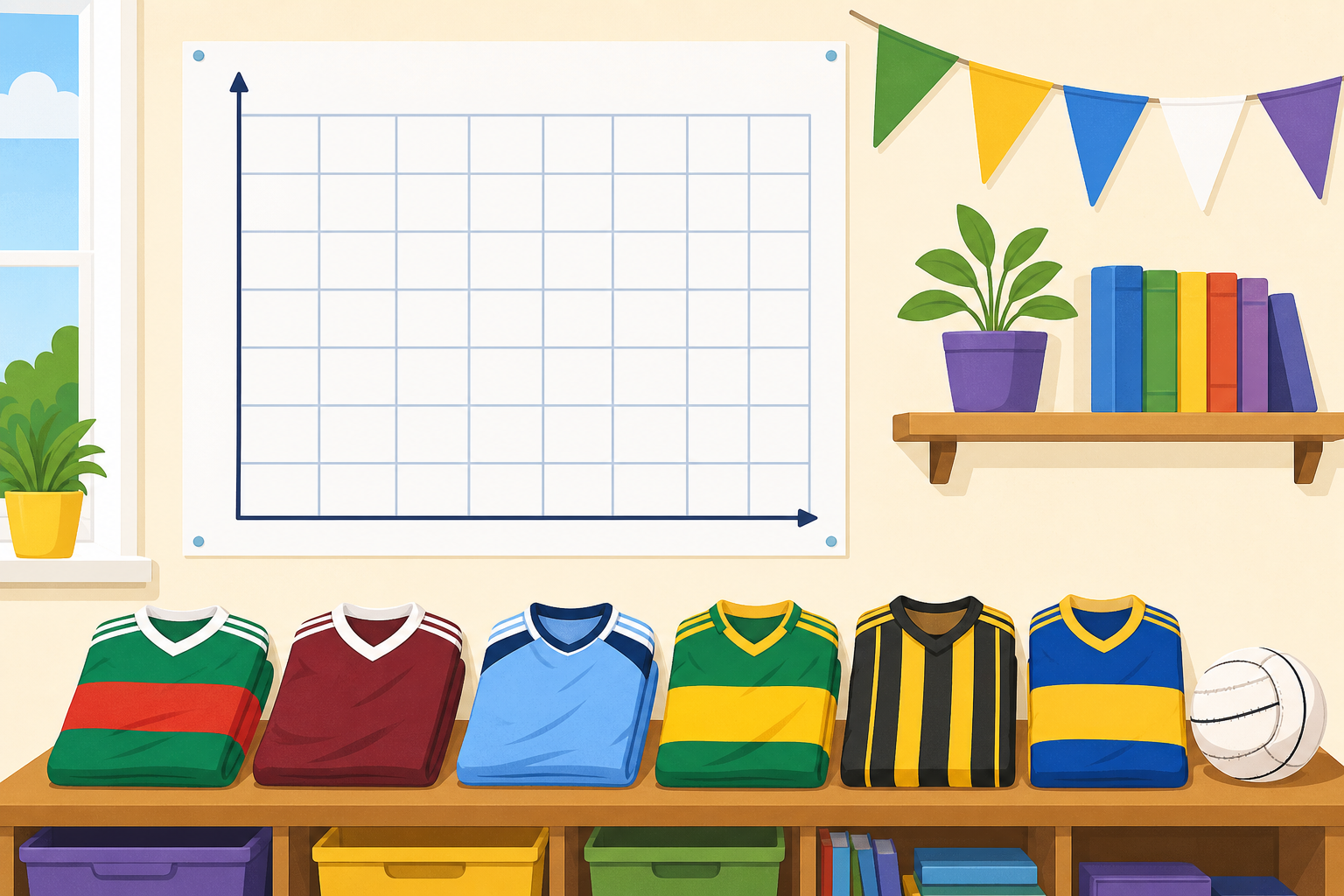
We asked the class to vote for their favourite GAA county. Hands up: how could we show all those votes so the whole class reads them at a glance? And what would a taller bar mean?
Watch these charts of our favourite-county votes. The first two show 6 votes drawn two different ways: once on a scale marked in 1s, once on a scale marked in 2s. Notice the second bar climbs half as many steps but stands for the same 6. Then watch two counties added side by side. Look at the last two charts carefully: the same two counties, 14 votes and 18 votes, are drawn first on a scale of 2 and then on a scale of 5. On the scale of 2 you can clearly see one bar is taller. On the scale of 5 the two bars look almost the same height, even though the votes have not changed.
Here is a sample set of lunch choices for our next chart. First we choose a scale that lets the biggest value fit. The biggest value is 12: a scale of 2 fits it in six steps (0, 2, 4, 6, 8, 10, 12); a scale of 1 would fit it too but in twelve steps, which is a lot of lines to mark. A scale of 2 is our choice. Then set each bar to the right height and check every bar is the same width:
In your maths copy on squared paper, draw and label the two axes. Mark the scale up the side in 2s (0, 2, 4, 6...). If you have time, draw the first bar from the class data to the right height.
Now we build these charts on the board, and the first job every time is to choose the scale. The biggest value in our full set is 20. Which scale should we mark up the side? Decide together, then build: first a bar to a value of 6, then a bar to 12, then a bar to 18, and last a full set of four bars — 8, 14, 6, 20. Every value here is even, so each bar top lands exactly on a marked line.
You're previewing this lesson. Get full access to this lesson and hundreds more — each one ready to teach, with interactive activities, printable resources and pupil progress tracking built in.