Mathematics
Advanced
50 mins
Teacher/Student led
+65 XP
Teacher-led from the board. Pupils do not need a device, but can follow on one.

Critically Evaluating Graphs and Misleading Data
Learn to spot three ways graphs mislead: chopped axes, uneven scales, and sized-up symbols. Read the real numbers, name the trick, and redraw graphs fairly starting at zero.
 Here are two bar charts side by side, both showing the exact same two numbers. In one, the scale starts at zero and the two bars look almost the same height. In the other, the scale starts at
 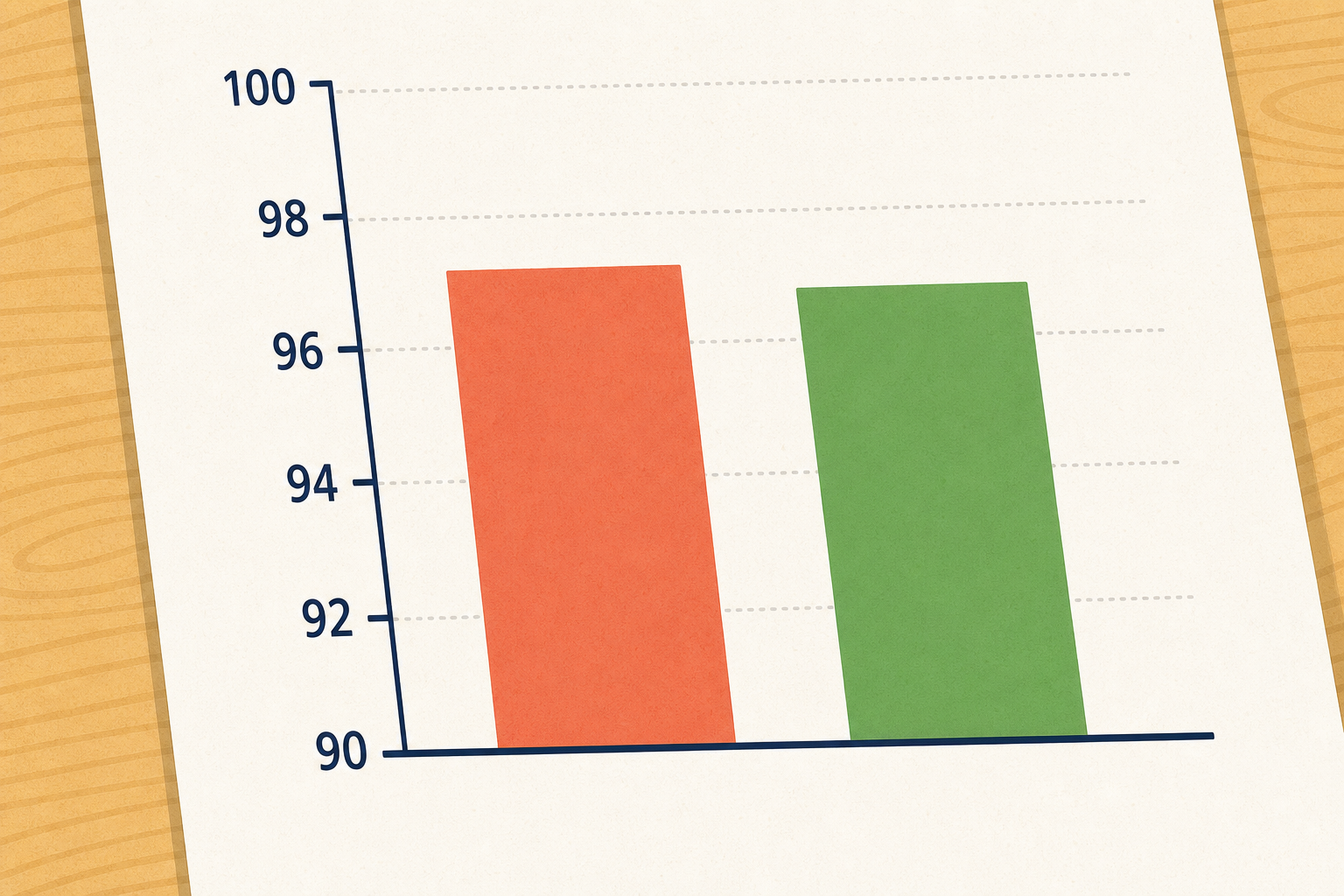 We will walk through three graphs that each bend the truth in a different way. Listen for the real numbers on each one, then look at the picture the graph paints. Watch for where the picture and the numbers disagree.
 Pick one misleading graph from today's lesson. In your maths copy, sketch the same data drawn fairly, using a scale that starts at zero with even gaps, or equal-sized symbols. Then write one sentence naming the trick the original graph used.