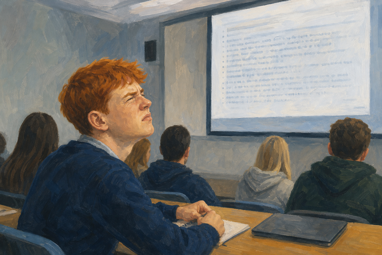
Look at the bullet-wall image in this lesson (or the first failure on the classroom screen). In under ten seconds, what went wrong first: too much text, no clear point, messy layout, or something else?
You have already looked at presentations that work. Today you do the opposite: you look at presentations that fail, and you name exactly why. Every strong presenter has made at least one of these mistakes. Today you learn to catch them before interview day, not on it.
Why this matters: VET means your Vocational Education Task interview presentation (format 1). The examiner will notice the same problems you learn to name here.
Quick glance back at the four design principles from the earlier tour:
| Principle | Why it helps |
|---|---|
| Contrast | The important thing stands out first |
| Repetition | Matching styles feel deliberate, not random |
| Alignment | Edges line up so the layout feels calm |
| Proximity | Related items sit together; unrelated items have space |
Also keep format fit in mind: the right shape for the job (slides for a short live talk, a short clip for a hook, and so on).
Today is the failure gallery. You will diagnose broken examples with short labels that map back to CRAP, then capture the three mistakes you are most likely to make on your own VET interview presentation.
Use this table while your teacher walks the failure gallery. For each broken example, pick one primary label before the class discusses it.
Must-know labels (use these first on every example):
bullet-wall visual clutter no hook/hierarchy
Only if we have time (stretch):
wrong format decoration noise
The gallery is three examples: the bullet-wall still in this lesson, plus a cluttered-versus-clear poster and a no-hook video your teacher will put on the screen. Label each one before the class discusses it.
| Concept | Why it matters | Example |
|---|---|---|
| bullet-wall — packing a full script onto every slide so the audience reads instead of listening (breaks Proximity and Contrast) | In a VET interview the examiner needs to hear you | Work Experience slide with 14 task bullets instead of one claim |
| visual clutter — too many fonts, colours, shapes, or images fighting on one frame (breaks Contrast, Alignment, and Repetition) | Clutter hides the one thing people should notice first | GAA fundraiser poster with five typefaces and three logos |
| no hook/hierarchy — nothing tells the eye or ear what matters first (breaks Contrast) | People decide in seconds whether to keep watching | Vertical phone video with a blank opening and no title for the first five seconds |
| wrong format — a format that fights the purpose or the audience (stretch: format fit) | A strong idea still fails in the wrong format | Long monologue for a two-minute VET interview slot |
| decoration noise — effects and transitions used because they exist, not because they help (stretch: breaks Contrast and Repetition) | Flashy extras can read as amateur | Every slide spinning in with a whoosh during a serious pitch |
As each broken example appears, pick one primary must-know label (and a stretch label only if you need it). Be ready to say the label, which CRAP principle it breaks, and the first thing you would cut. You will use these labels on the opinion line and on your Mistakes to Avoid page.
Place your marker on each statement using the on-screen opinion line. There is no score. Be ready to say why you stood where you stood, and whether a classmate’s reason would move you.
After each statement, we will park one strong mistake phrase on the board for your checklist in the Portfolio Build.
If the interactive is slow to load, follow along from this list while your teacher reads each statement aloud.
| Issue | Solution |
|---|---|
| I can say a design "looks bad" but I cannot name the failure | Use the must-know labels first: bullet-wall, visual clutter, no hook/hierarchy. Name the CRAP principle it breaks, then pick one fix before you move on. |
| Every mistake feels equally serious, so I cannot choose a top three | Rank by VET risk. Ask: would this lose the examiner in the first 20 seconds, hide my evidence, or make me read instead of speak? Promote those to your top three. |
| I am describing someone else’s bad example, not my own risk | Rewrite each mistake as "I will avoid…" plus one concrete check you will run on your own VET work (for example, "no more than six lines per slide"). |
Before you open a blank document, study one complete line in the shape you will write three times:
1. bullet-wall (breaks Proximity and Contrast) — I will avoid packing my enterprise pitch slides with task lists because the examiner needs to hear me, not read me. Check: max one claim and two spoken examples per slide (Something Real: my side-hustle pitch).
Notice the parts: failure label, CRAP link if you can name it, personal "I will avoid" risk, why it hurts the interview, one check you can actually run, tied to a named project.
If you are unsure of your Something Real name: use the working title on the teacher board, or write my VET interview presentation for today and update the title later.
Sentence starter: I will avoid [label] on my [format] by [check], because [VET harm].
Model (copy the shape, not the topic): 1. bullet-wall (breaks Proximity and Contrast) — I will avoid packing my enterprise pitch slides with task lists because the examiner needs to hear me, not read me. Check: max one claim and two spoken examples per slide (Something Real: my side-hustle pitch).
You're previewing this lesson. Get full access to this lesson and hundreds more — each one ready to teach, with interactive activities, printable resources and pupil progress tracking built in.