Today you will
- learn four design rules: Contrast, Repetition, Alignment and Proximity (CRAP)
- fix a messy sample flyer
- redesign one page from your own project so it looks professional
Warm-up
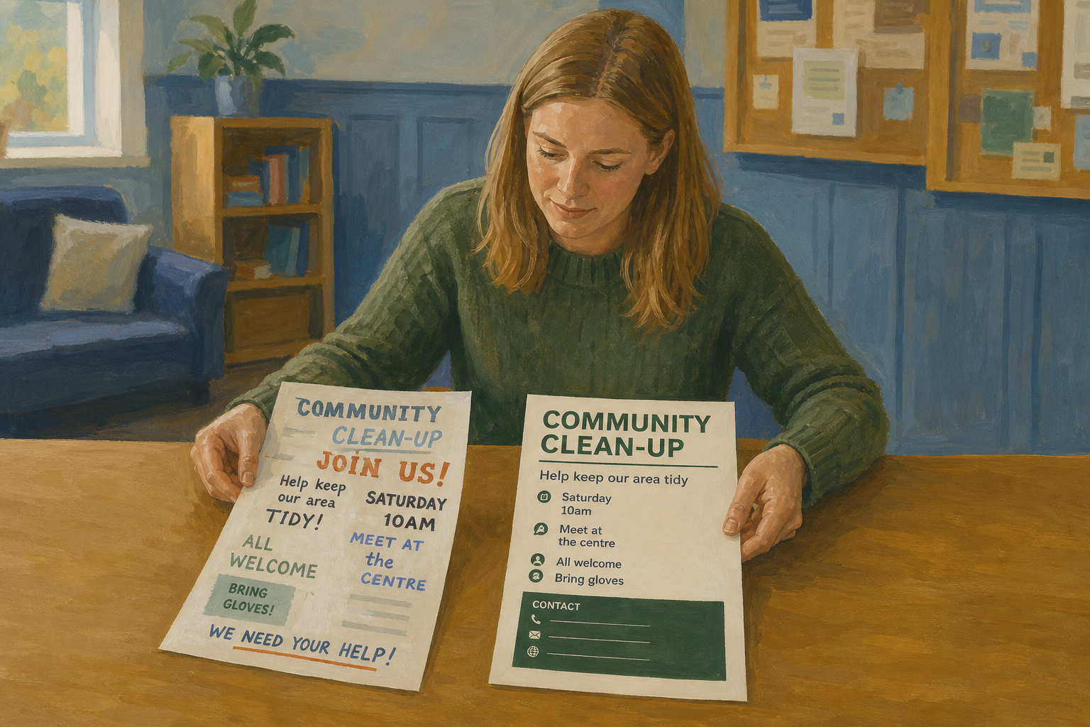 Think of one document that looked professional and one that looked messy. What caught your eye first on the good one?
Contrast means the important thing looks clearly different, like a big bold title.
Repetition means you use the same fonts, heading sizes and colours all the way through.
Alignment means things line up along one edge, not dotted around the page.
Proximity means related things sit close together, with space between groups.
Example
A title at 22 pt bold stands out above body text at 11 pt. Your name, phone and email sit together as one small block.
Make the messy flyer Saturday Skills Swap as {{code:sm1_crap_demo.docx}} in {{code:01_drafts}}. Copy these six lines into it:
saturday skills swap!!!
community centre saturday 10:00-13:00 free
a free community skills-share at the centre. bring a skill, teach a skill, stay for tea.
we need help with: sign-in desk, tea station, kids craft table, tidy-up
contact aoife 087 000 0000
aoife@email.ie
Then follow the steps in the box below to fix it. Keep the finished flyer open, because it is your model for the next task.
Common issues
- If you used lots of fonts and colours, go back to one or two fonts and one colour.
- If you have big empty gaps, delete the blank lines and use paragraph spacing instead.
- If you can't find Align Left or spacing in Word, look on the Home ribbon. In Google Docs, use {{menu:Format -> Line & paragraph spacing}}.
Independent Practice
- In {{code:sm1}}, pick one finished notice or short letter from your project.
- Make a copy in {{code:03_finished}} and call it {{code:sm1_doc5_crap_applied.docx}}.
- Make the title bigger and bold, and give every heading the same style.
- Line up the body text on the left.
- Group related lines together and add space between sections.
If you have no finished page, copy {{code:sm1_crap_demo.docx}} from {{code:01_drafts}} and make it a notice for your project.
- {{code:sm1_doc5_crap_applied.docx}} is saved in {{code:03_finished}}.
- The title, headings and body are easy to tell apart.
- My headings, fonts and spacing match all the way down.
- Related details sit together, with space between sections.
Unlock the full learning experience
You're previewing this lesson. Get full access to this lesson and hundreds more — each one ready to teach, with interactive activities, printable resources and pupil progress tracking built in.
This lesson is copyright of Coding Ireland 2017 - 2026. Unauthorised use, copying or distribution is not allowed.