
Today you will
- sort, filter and chart a bake sale table
- use an IF formula and colour to spot the best sellers
- build one chart from your own project numbers that changes a decision
Think of a chart you saw recently, like a weather forecast or match stats. Was it bars, a pie or a line? What did it show you at a glance?
Key words
- Sort puts rows in order, and filter hides rows you don't need without deleting them.
- Chart type matters. Use columns to compare items, a pie to show shares of a whole, and a line to show change over time.
- Conditional formatting colours cells automatically when they match a rule.
- An IF formula writes a label for you, based on a rule you set.
{{formula:=IF(D2>=50,"Best seller","OK")}} checks if D2 is 50 or more. If it is, it writes Best seller. If not, it writes OK.
In the bake sale table, Cupcakes and Cookies earn €60 each, so they get Best seller. Brownies, Scones and Tea earn less than €50, so they get OK.
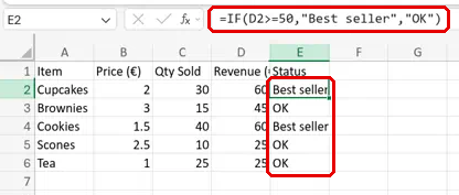
You will add formulas, sort, filter, make two charts and colour the best sellers in a charity bake sale table. Follow the steps in the box below and tick each one.
If time runs short, the pie chart and the colour rule can be finished at home.
For the last step, use this pattern in your own words:
The chart shows [what the numbers say], so I'm going to [specific change you'll now make].
Example: The chart shows Cupcakes and Cookies earn the most, so I'm going to bake more of those for the next sale.
Common snags
| If you see | Do this |
|---|---|
| Your sort mixed up the rows. Item names no longer line up with their prices. | Press {{kbd:Ctrl+Z}} ({{kbd:Cmd+Z}} on a Mac) to undo it. Select {{cell:A1}} to {{cell:E6}}, then sort again. |
| Your IF formula shows an error. | Retype it yourself so the quote marks are straight. |
| Your chart shows the wrong data. | Delete the chart. Type {{code:A1:A6,D1:D6}} in the Name Box, not in a cell, and insert the chart again. |
Independent Practice
- Open {{code:05_numbers_sheet}} and save a copy called {{code:06_decision_chart}} in {{code:Digital_Portfolio}}. In Excel use {{menu:File -> Save a Copy}}. In Google Sheets use {{menu:File -> Make a copy}}.
- In the copy, type the question your chart will answer above your data, for example: Which cost is the biggest?
- Select the data that answers it and insert the right chart: columns to compare, a pie for shares, or a line for change over time.
- Give the chart a title that names your question.
- Below the chart, type your decision sentence in this pattern:
- {{code:06_decision_chart}} is a copy, and my {{code:05_numbers_sheet}} is unchanged.
- My chart's title names the question it answers.
- I can say in one sentence why I chose this chart type.
- My sentence names a specific change to my project.
Unlock the full learning experience
You're previewing this lesson. Get full access to this lesson and hundreds more — each one ready to teach, with interactive activities, printable resources and pupil progress tracking built in.
This lesson is copyright of Coding Ireland 2017 - 2026. Unauthorised use, copying or distribution is not allowed.