Today you will
- format a short practice page
- make your {{code:03_proposal_draft}} look clean and easy to read
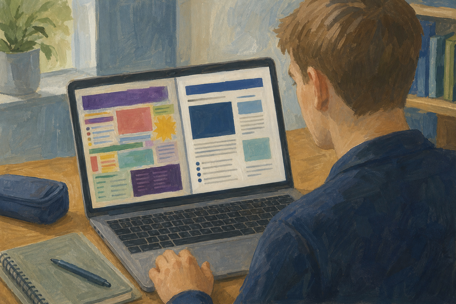 If you don't have {{code:03_proposal_draft}} yet, make a new document with that name in {{code:03_documents}}. Then finish these three lines in your own words.
I want to…
It is for…
My first target is…
Warm-up
Think of a flyer you scrolled past without reading. Was the idea bad, or was every word shouting in a different colour?
The body font is the one clear font for your main text, such as Calibri or Arial at 12 pt.
A heading is a bigger, bold line that starts a section, such as 16 pt bold.
Emphasis means making one phrase bold or italic so the reader notices it.
Less is more means using few formatting tools, because too much colour and underline looks messy.
In a sentence about your sales target, bold only the words "ten confirmed orders".
Today your proposal stays black, with no underline.
You will make a short practice page about a GAA scarf business and format it so it looks clean. Follow the steps in the box below. The steps marked Extra are only for when you finish early.
Always select the text first, so it is highlighted blue, before you click a formatting button.
You can copy this text instead of typing it.
Custom GAA scarf embroidery plan
I plan to start a small custom embroidery business making personalised GAA club scarves for local clubs. My first-month goal is ten confirmed orders so I can prove the idea works before I spend more on stock.
Common problems
- Bold did nothing. Select the text first so it is highlighted, then click {{btn:B}}.
- Everything went bold. Press {{kbd:Ctrl+Z}} to undo, then select only the words you want.
- My font list looks different. That's fine. Pick any plain font, like Arial or Calibri.
Portfolio Build
- Open {{code:03_documents}}, then {{code:03_proposal_draft}}. Keep the same file and name.
- Set all the main text to one clear font at 12 pt.
- Give your proposal a 16 pt bold heading.
- Make one phrase bold or italic. Pick the phrase with your key target or decision.
- Check that the file shows as saved.
Do not use underline or colour on this file.
- My body text uses one clear font at 12 pt.
- My heading stands out.
- Only one phrase is bold or italic.
- There is no underline or colour, and the file is saved.
Unlock the full learning experience
You're previewing this lesson. Get full access to this lesson and hundreds more — each one ready to teach, with interactive activities, printable resources and pupil progress tracking built in.
This lesson is copyright of Coding Ireland 2017 - 2026. Unauthorised use, copying or distribution is not allowed.