Today you will
- add up your costs into category totals
- make a pie chart with percentages on it
- add the pie to {{code:06_ka2_charts}}, beside your bar chart
Warm-up
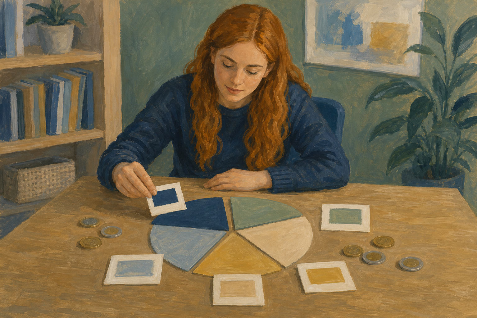 Think about the budget for your Something Real project. If you split it into groups like materials, travel and promo, which group would take the biggest slice?
A pie chart is a circle cut into slices that show parts of a whole.
Parts of a whole means every slice comes from one total, so they add up to 100%.
A category total is one group's costs added up. You chart these, not every item.
Percentage labels show each slice's share, like 11%.
Use a bar chart instead if you would have over 6 slices or negative numbers.
Aoife's cupcake stall has three ingredient costs: €40, €30 and €15. Together they make one Ingredients slice of €85.
You will turn Aoife's cupcake budget into a pie chart, in a new practice file. Watch your teacher first, then follow the steps in the box below.
Item list (E1 to G9)
| Category | Item | Cost (€) |
|---|---|---|
| Ingredients | Flour and sugar | 40 |
| Ingredients | Butter and eggs | 30 |
| Ingredients | Toppings | 15 |
| Packaging | Boxes | 18 |
| Packaging | Labels | 10 |
| Equipment | Mixer hire | 45 |
| Marketing | Flyers | 20 |
| Transport | Van fuel | 12 |
Category totals (H1 to I6)
| Category | Total (€) |
|---|---|
| Ingredients | 85 |
| Packaging | 28 |
| Equipment | 45 |
| Marketing | 20 |
| Transport | 12 |
If you sort the totals, the order will be Ingredients, Equipment, Packaging, Marketing, Transport.
Common issues
- Lots of tiny slices? You charted the item rows. Select only the totals table and insert the pie again.
- Wrong numbers or a blank slice? Select just the category rows and headings, with no empty or Total rows. Then make a new chart.
- Can't find percentages? In Excel, click {{btn:+}} and turn on Data Labels. In Sheets, open {{btn:Customise}}, then {{btn:Pie chart}}, then Slice label.
Independent Practice
- Open {{code:06_ka2_charts}} in {{code:Project_Portfolio}}, in the {{code:06_charts}} folder.
- Group your budget items into 3 to 6 categories.
- Add up each category and type a table with Category and Total columns.
- Select only that table and insert a pie chart.
- Turn on percentage labels and type a short, clear title.
If a category is tiny, add it into a group called Other.
- My totals table has 3 to 6 categories.
- My pie shows a percentage on each slice.
- It has a short, clear title.
- It's saved in {{code:06_ka2_charts}} next to my bar chart.
Unlock the full learning experience
You're previewing this lesson. Get full access to this lesson and hundreds more — each one ready to teach, with interactive activities, printable resources and pupil progress tracking built in.
This lesson is copyright of Coding Ireland 2017 - 2026. Unauthorised use, copying or distribution is not allowed.